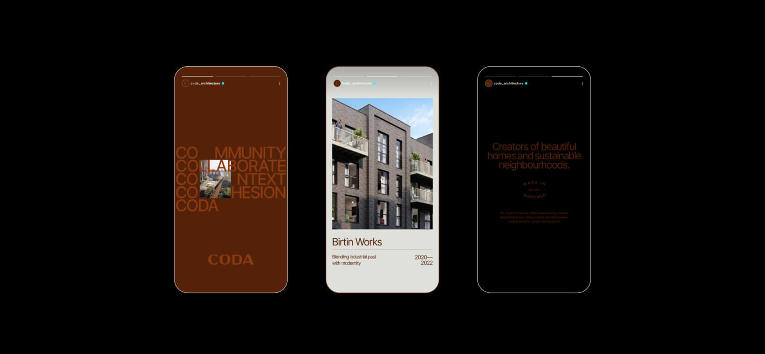
CODA — Beautiful
homes and sustainable
neighbourhoods.
A bold, refined brand identity shaped to bring CODA’s purpose to life, capturing the spirit of their next chapter.
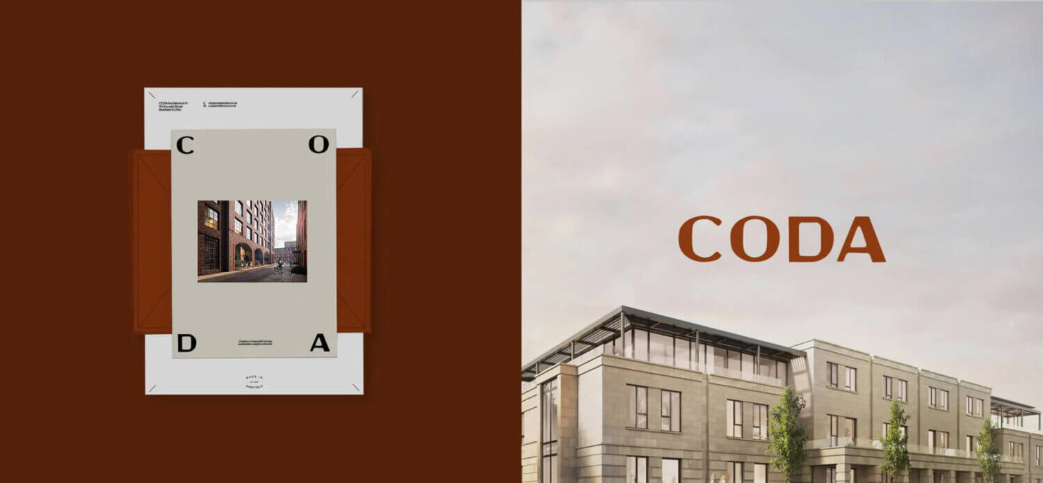
A tactile mark rooted in the beauty of functional design.
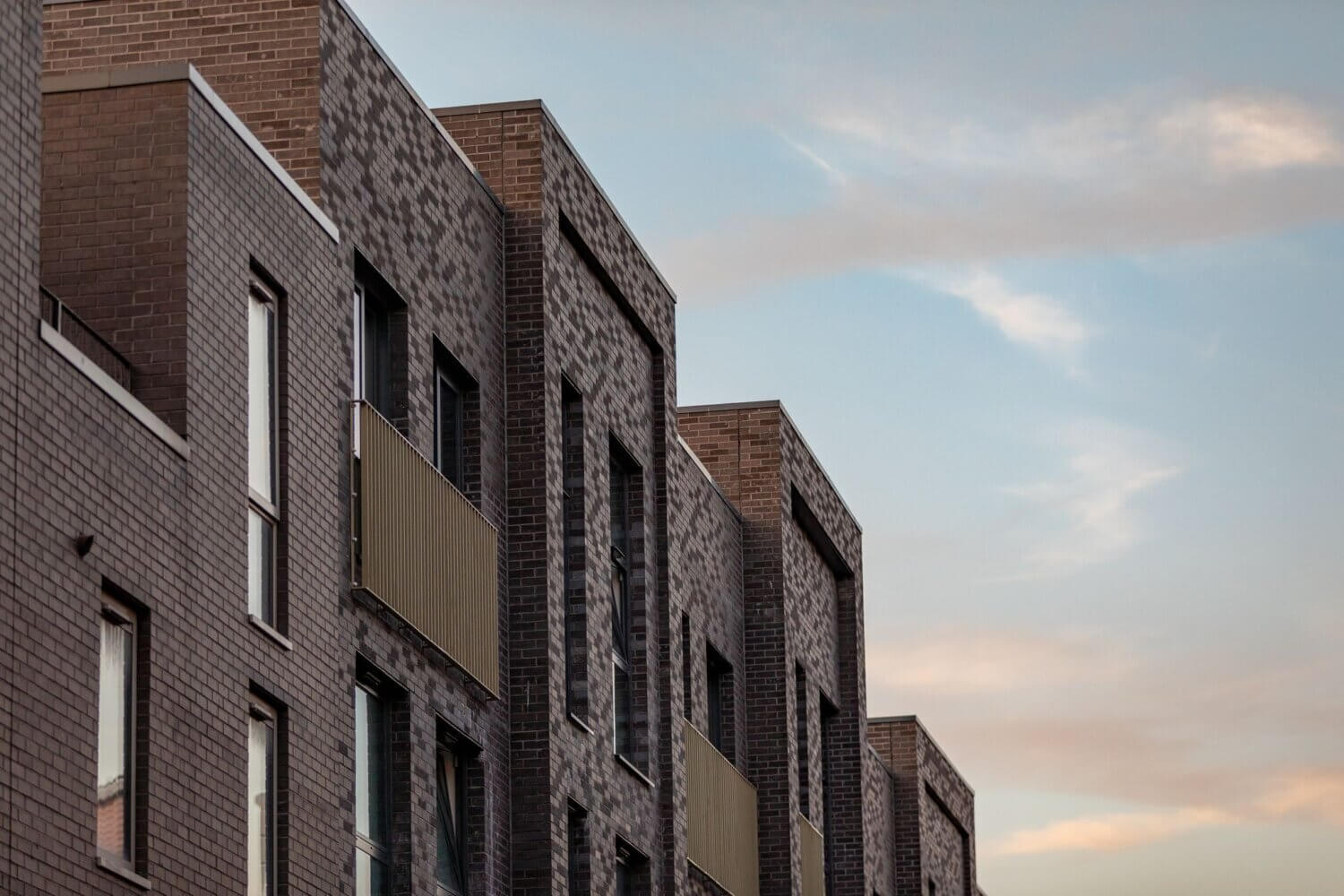
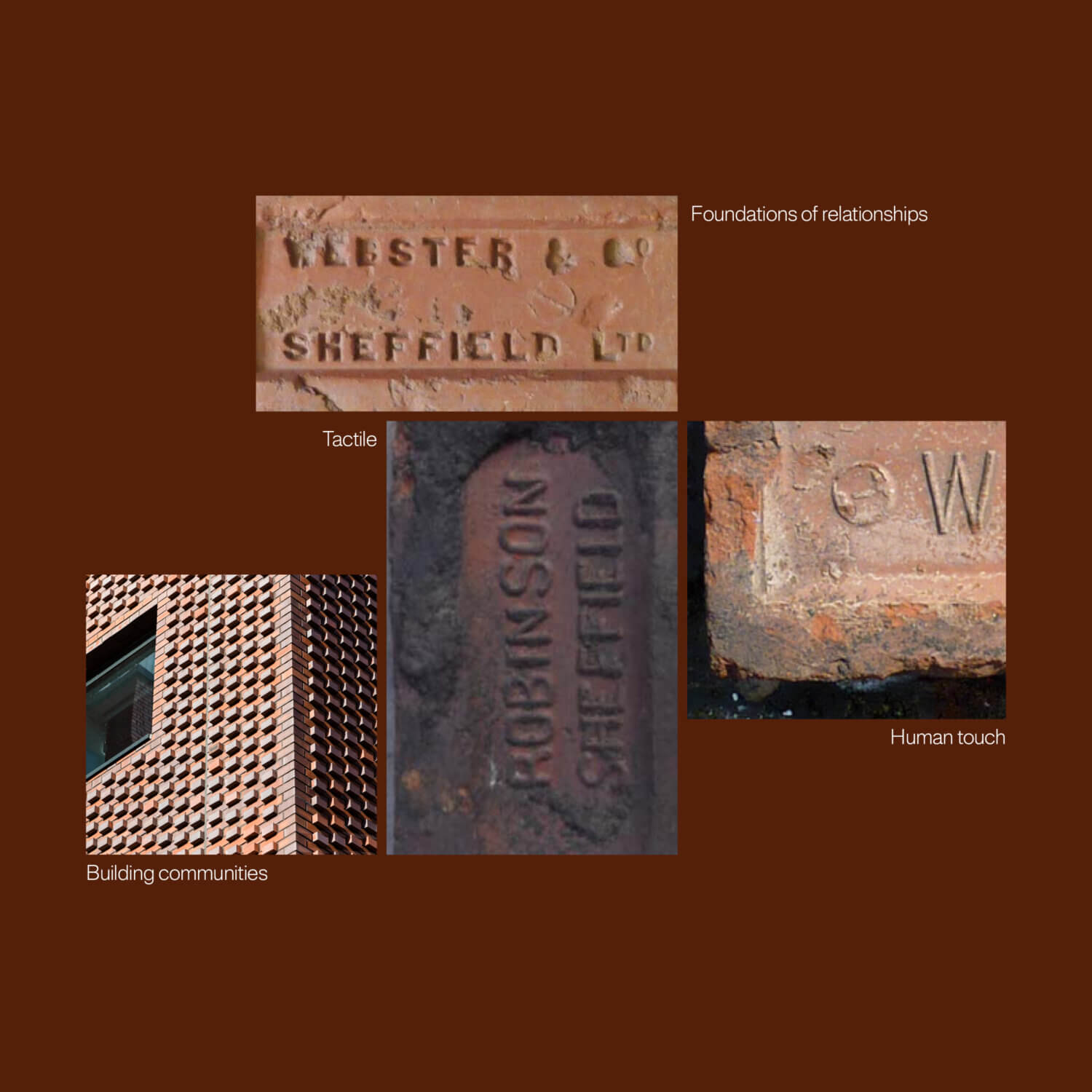
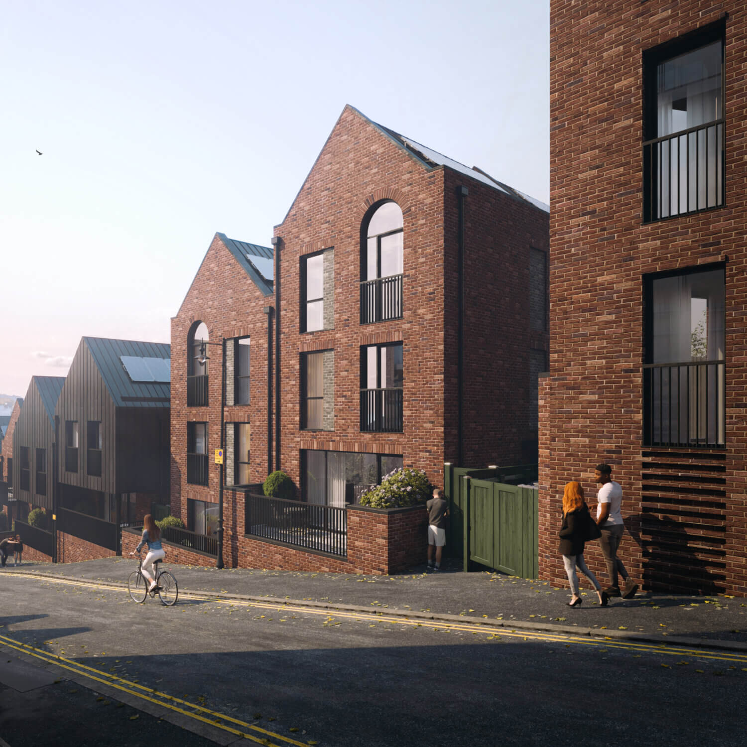
At the heart of the Sheffield based practice is a studio both commercially astute and deeply design-led. We wanted to create a brand that was true reflection of not only their creative and technical capabilities, but their pragmatic approach to designing things their clients can actually build. For this we looked to the famous Sheffield Brick, a simple material but capable of the most elegant of buildings, in the right hands. Inspired by the imprints the mark feels tactile yet considered, technical but by hand. The foundation stone of a new brand strategy.
Through a study of the stamped typography we defined letterforms that appear pressed, softened yet leave straight lines and angles. This informed the combination of rounded, straight and angular elements for the typemark, giving it a tactile quality without losing structure. The result is a mark that feels grounded in the city, connected to making and robust enough to sit within a clear, contemporary design system.
Timeless design, grounded in context.
One of the challenges with rebranding a practice such as CODA is respecting legacy whilst moving things forward. The practice has a rich history in bespoke private residential yet it’s recent history is more reflective of multi home developments across both apartments and houses, with the future vision and most recent works taking place in a more holistic neighbourhood overview including leisure and commercial buildings. The challenge therefore was how to create a brand that captures and speaks to all of the above.
This diverse portfolio however has always been grounded in the values that CODA bring to their projects and that is where we found the direction that ties it all together. CODA are known for fostering a collaborative culture that listens to clients, values creative freedom, strives to enrich lives and neighbourhoods with timeless, sustainable design that can be realised. This key end point focus, a practical and pragmatic approach means from the outset vision, what they say, design and imagine, can and should be built.
How we
created feeling
In approaching the CODA Architects rebrand, we focused on capturing the unique duality at the heart of their practice: a studio that is both commercially astute and deeply design-led. From the outset, it was clear they needed a brand that reflected both their technical rigour with creative energy. To write the next chapter of CODA one of a collaborative culture, and timeless sense of style.
Our strategy started with Sheffield, with their home as they so often do for others, centred on crafting an identity that could flex between their bespoke and commercial audiences, while reinforcing their mission of enriching lives and neighbourhoods through architecture. Truly ownable to them and their Sheffield routes, done with integrity and reflective of their legacy-driven values and enabling more meaningful storytelling for their neighbourhoods to come. CODA – Made in Sheffield.


A Legacy Refined
This rebrand was about more than a new logo or look, it was an opportunity to distil twenty years of CODA’s legacy into a brand that feels as considered and enduring as their architecture. The result is a confident, cohesive identity that reflects who they are today, and where they’re heading next.