Diamond Construction —
craftsmanship at scale
in the Bay Area.
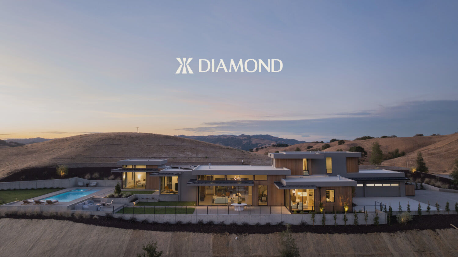
A purpose driven construction company making craftsmanship, quality and commitment to leaving a positive legacy sit at the heart of their generational family business.
A unique brand mark rooted in quality craftsmanship
The Diamond logomark was inspired by the Japanese sunrise dovetail woodworking technique, it also combines the initials ‘J’ and ‘K’ as a tribute to the father and son heritage at the heart of the business. The mark is based on a centuries old woodworking technique with a timeless and contemporary execution.
The symbol embodies Diamond’s belief in building with care, craft and longevity. It’s all about taking extra time and effort to do things the right way for the best result.
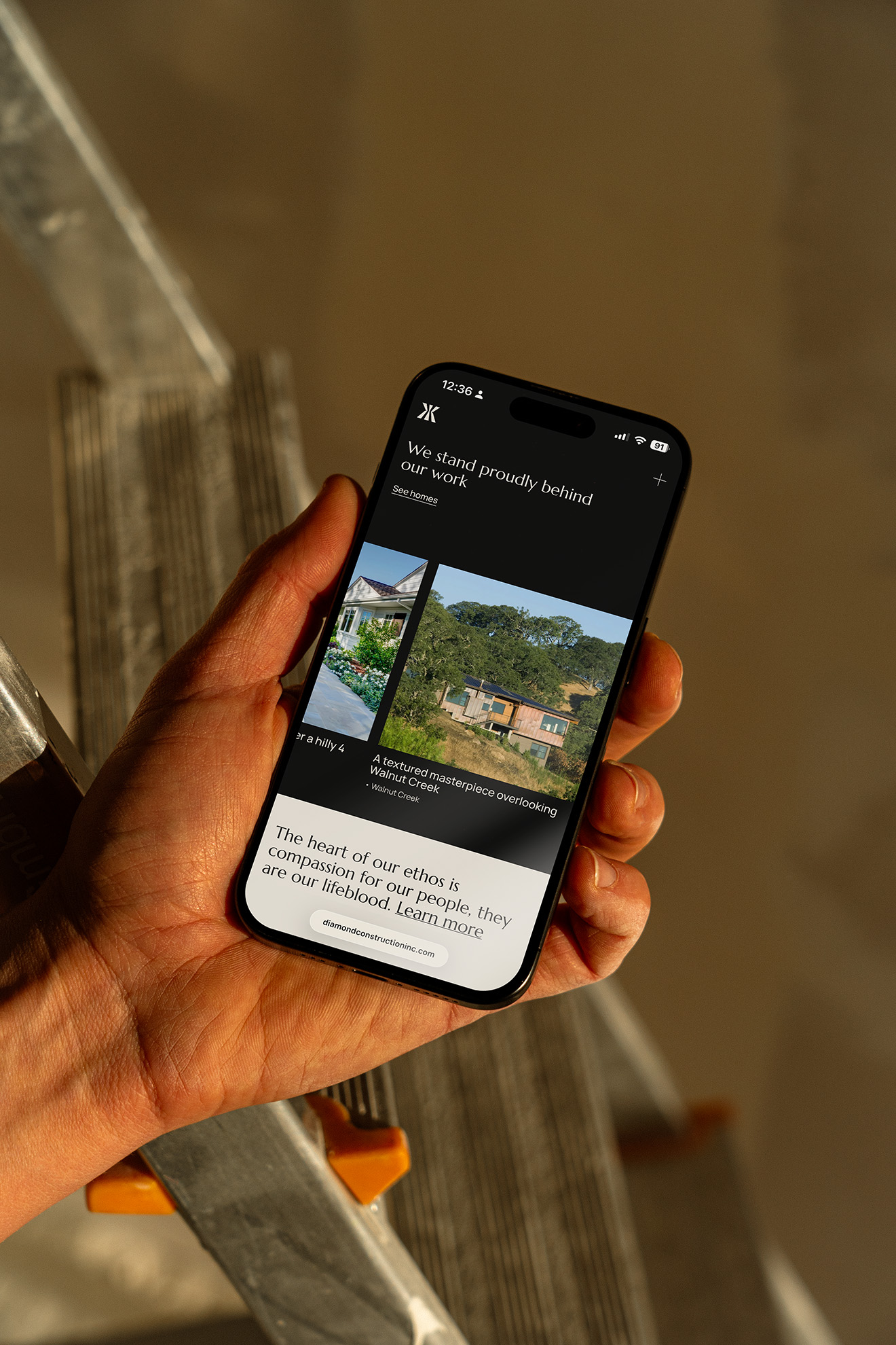
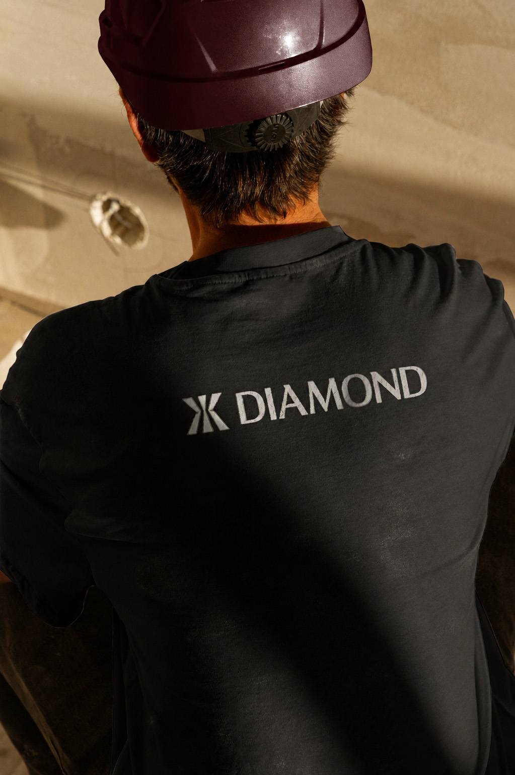
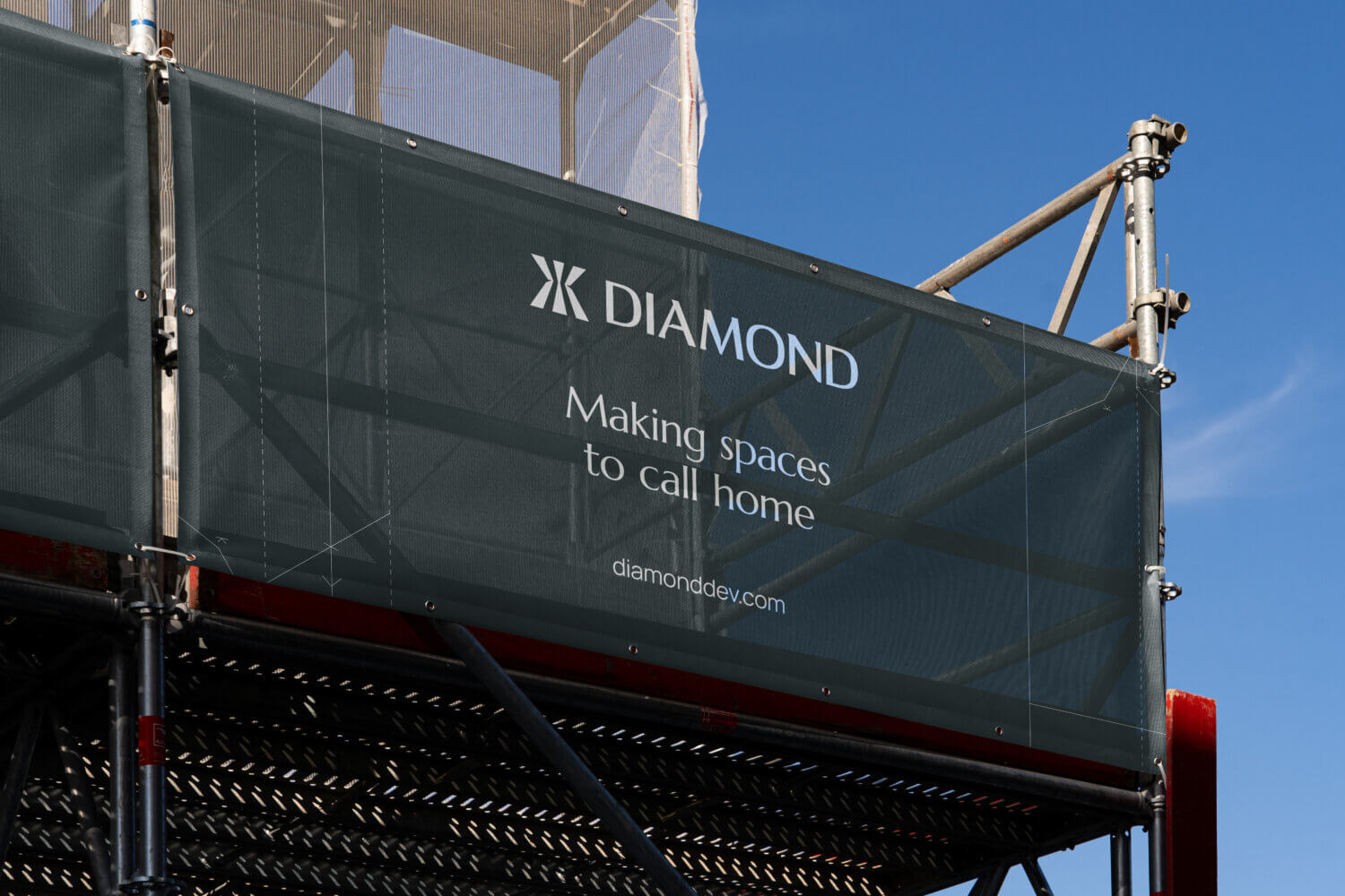
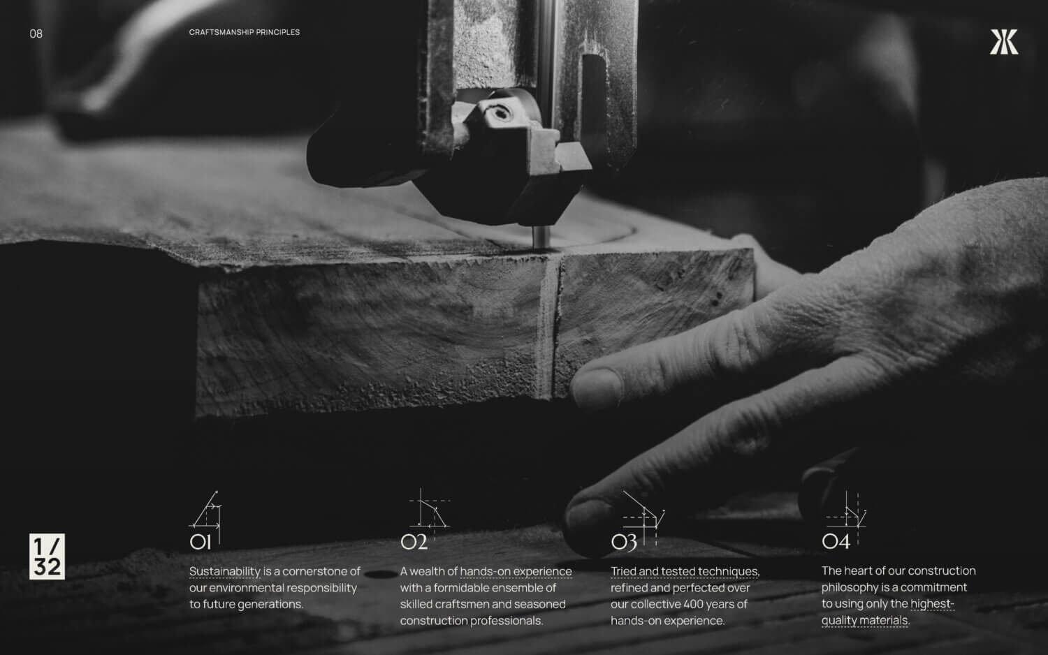
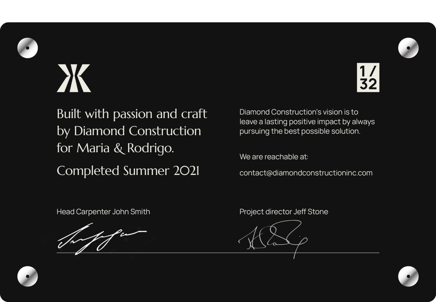
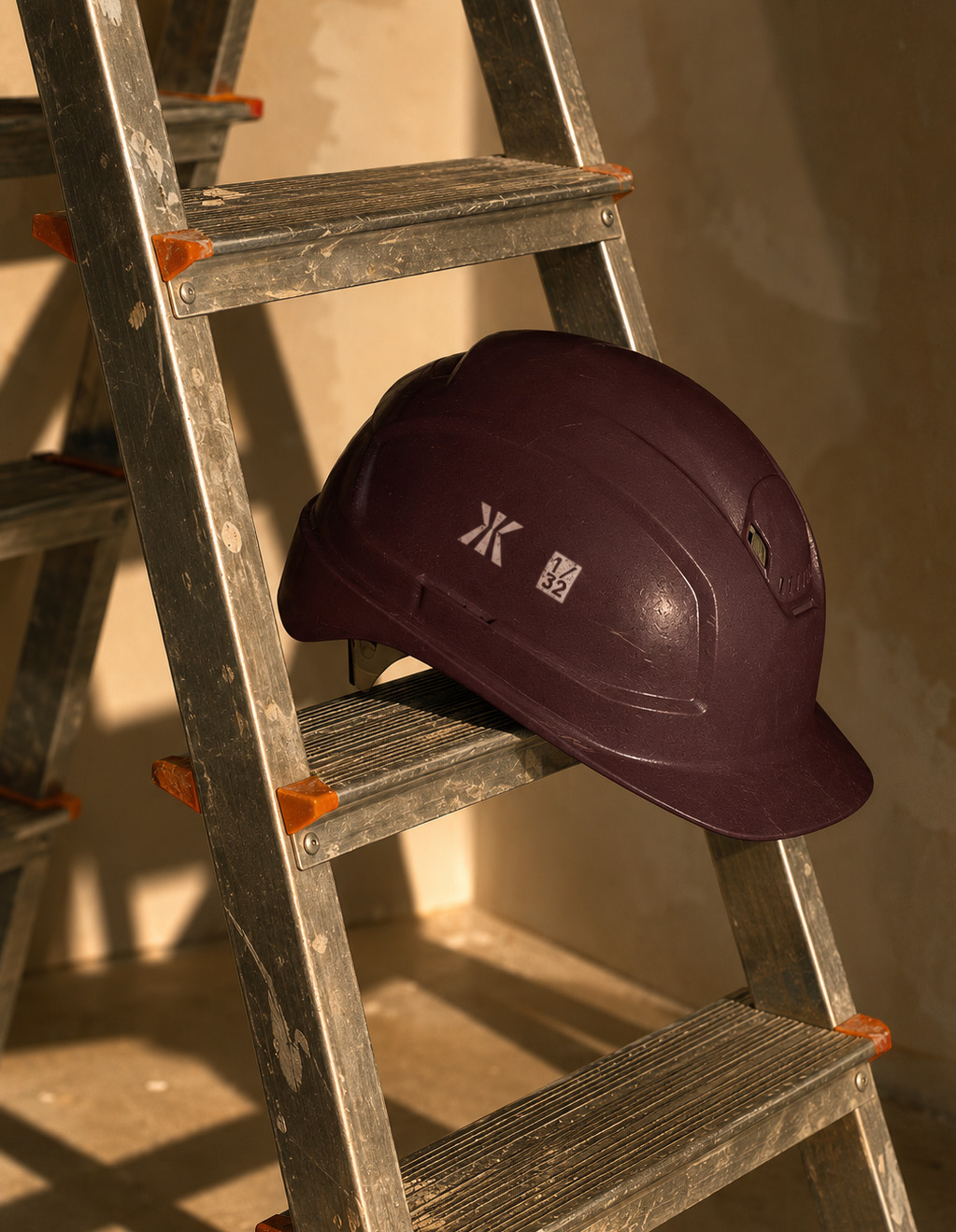
An additional brand asset represents Diamond’s policy of delivering to a 1/32 inch precision tolerance against plans. A commitment to quality craftsmanship.
How we
created feeling
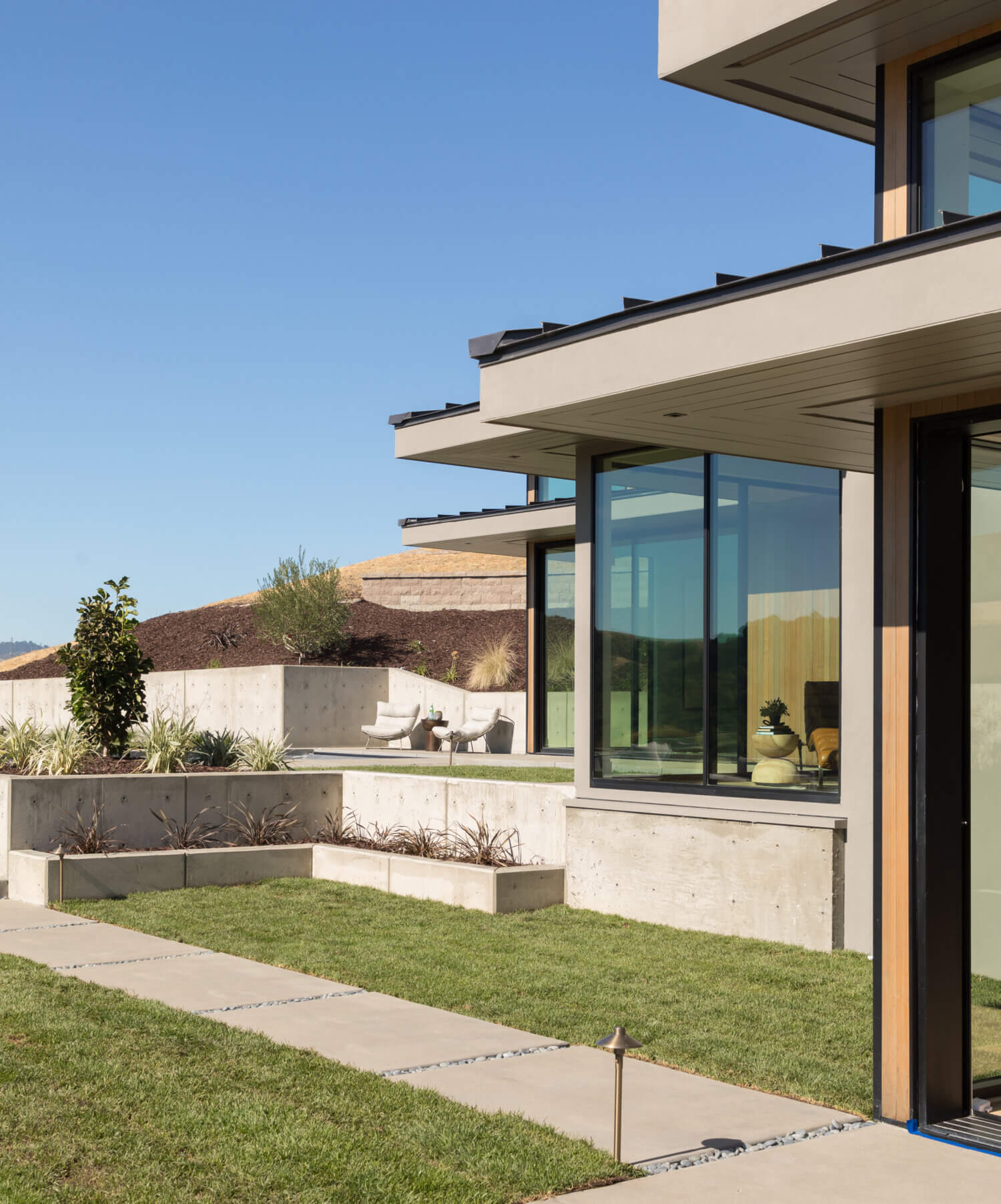
The work was built around the principles that define Diamond’s approach: precision, longevity, craftsmanship with the heart of a father/son family business. Inspired by traditional joinery techniques and premium natural materials, the brand language is minimal, elegant, considered and timeless.
We combined refined typography, understated layouts and material-led textures to create a sense of warmth and quiet confidence throughout the experience. Every interaction was designed to reinforce the feeling of care and attention to detail that goes into Diamond’s work, positioning the business less like a conventional contractor and more like a modern craft-led atelier driven by a family legacy.
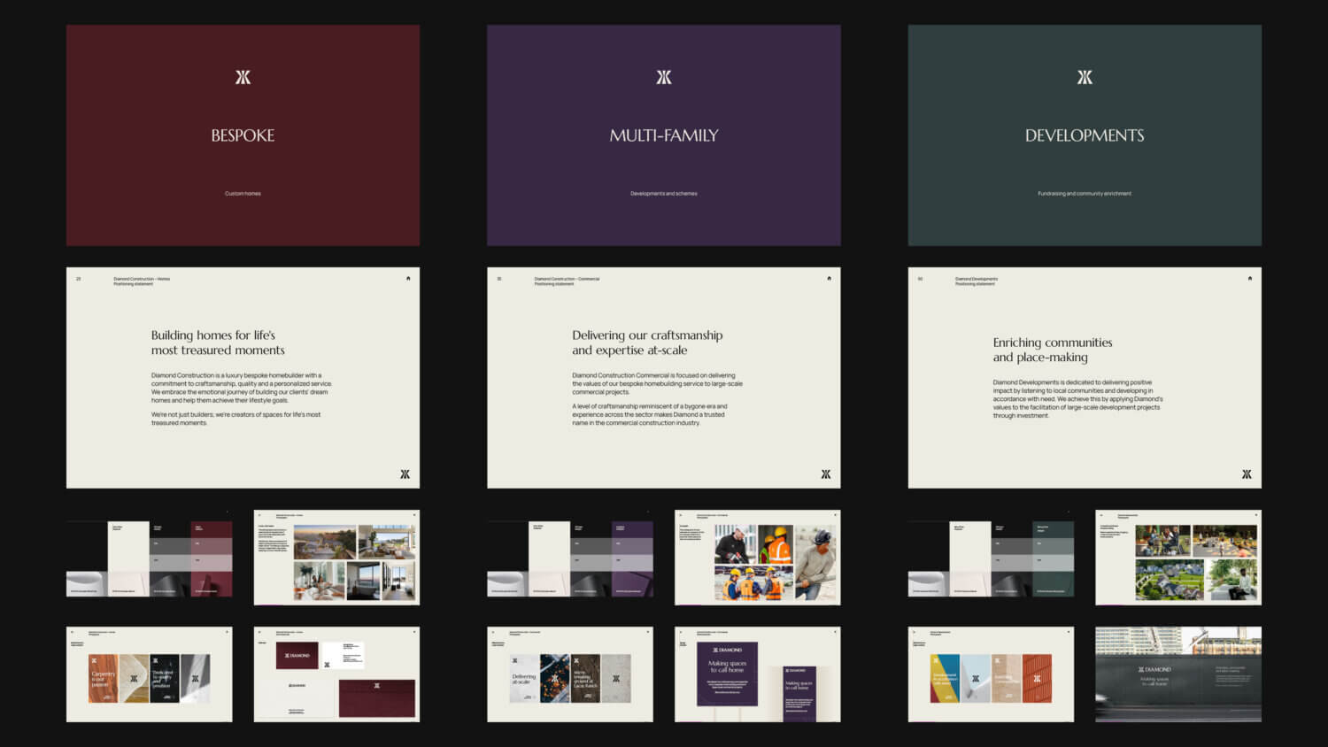
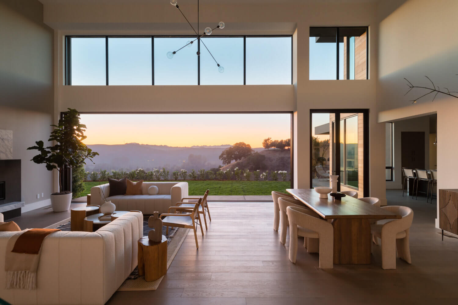
We extended the system across Diamond’s three business divisions through distinct colourways, messaging and photographic styles tailored to each audience. Bespoke Homes focused on luxury, warmth and emotional connection, Multifamily leaned into expertise and scale, while Developments centred around community enrichment and long-term impact. The result is a cohesive brand architecture with enough flexibility to speak credibly across multiple sectors without losing a unified identity.
Bringing Diamond's projects to life
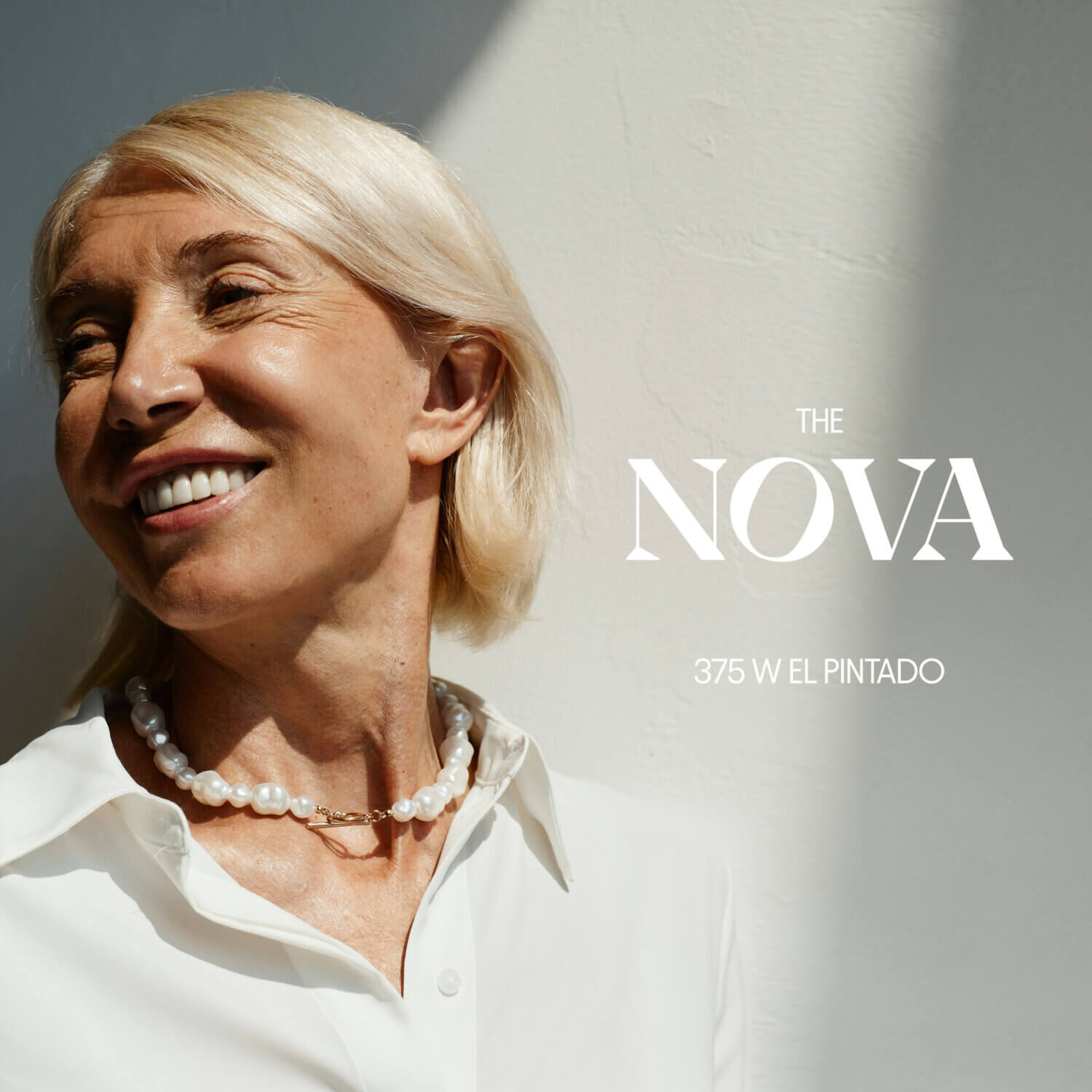
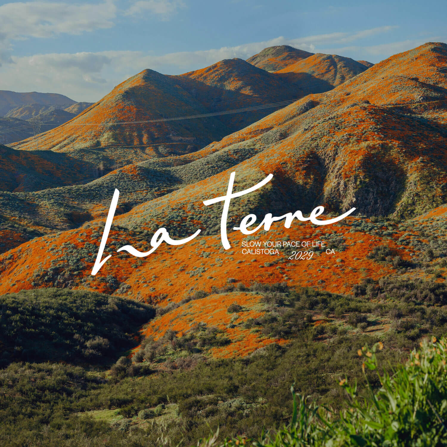
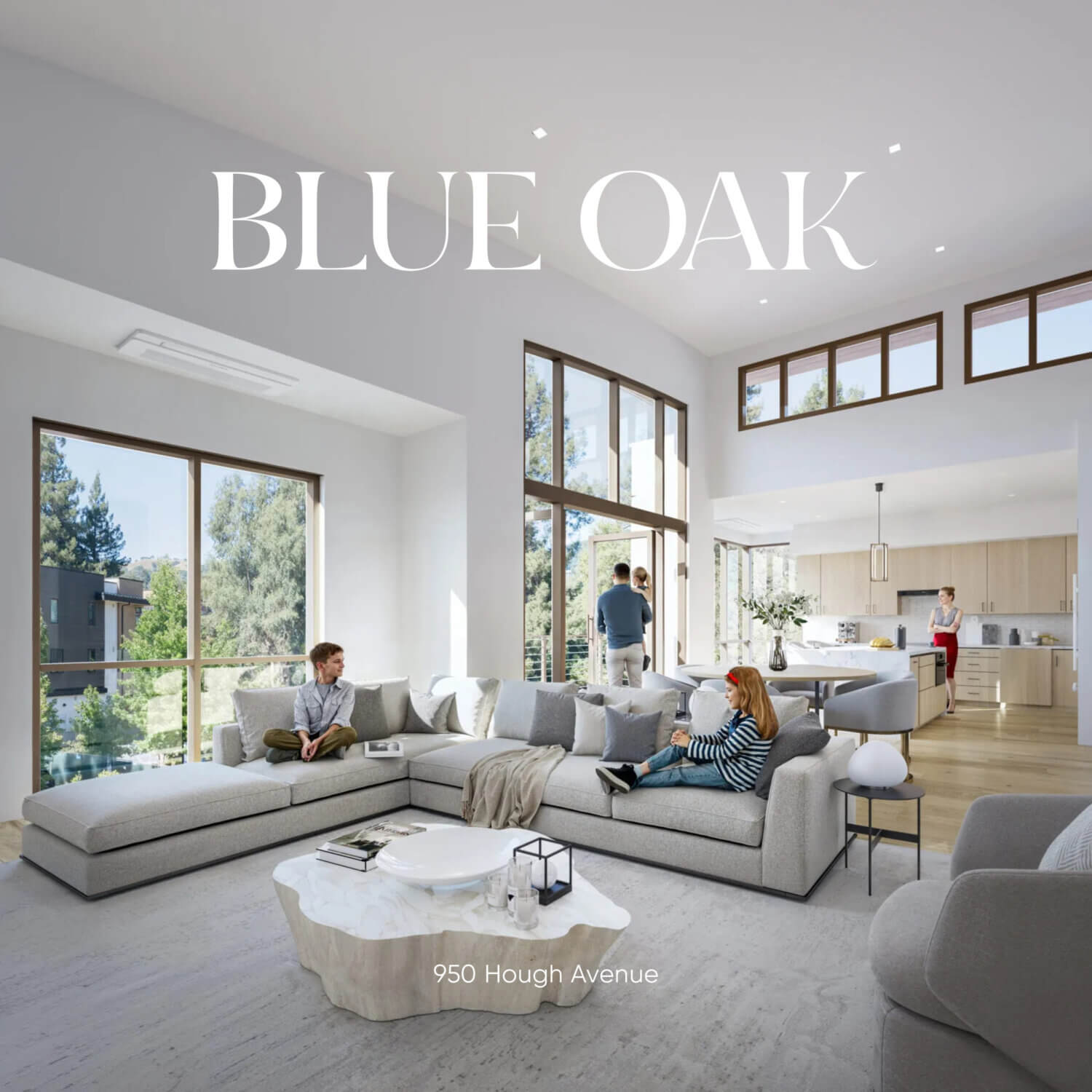
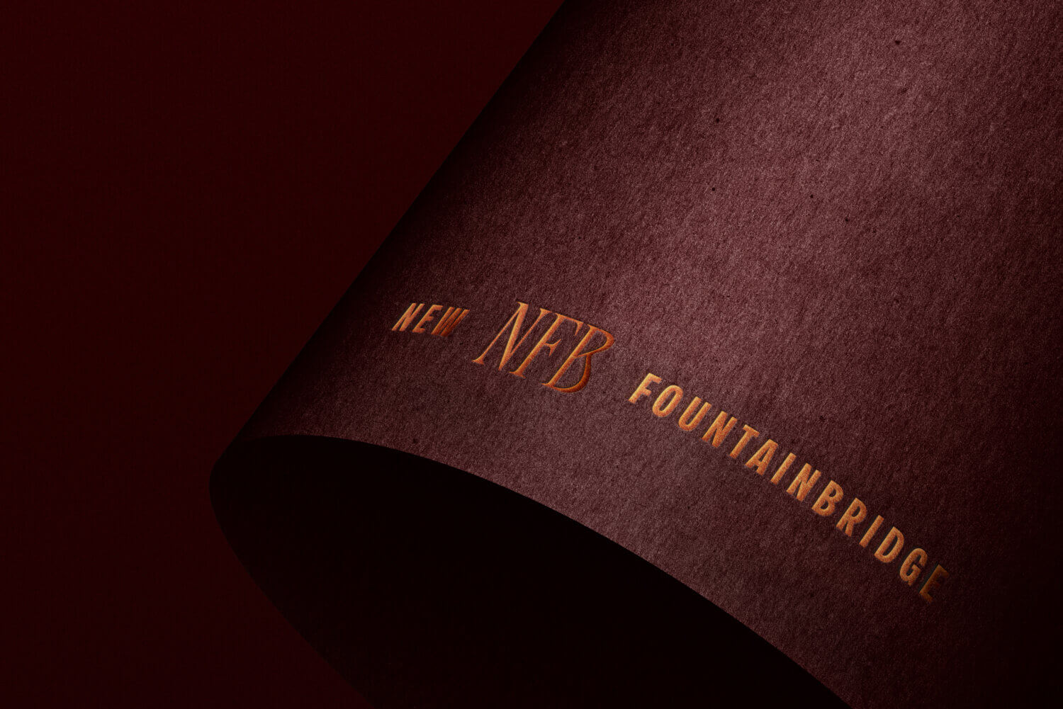
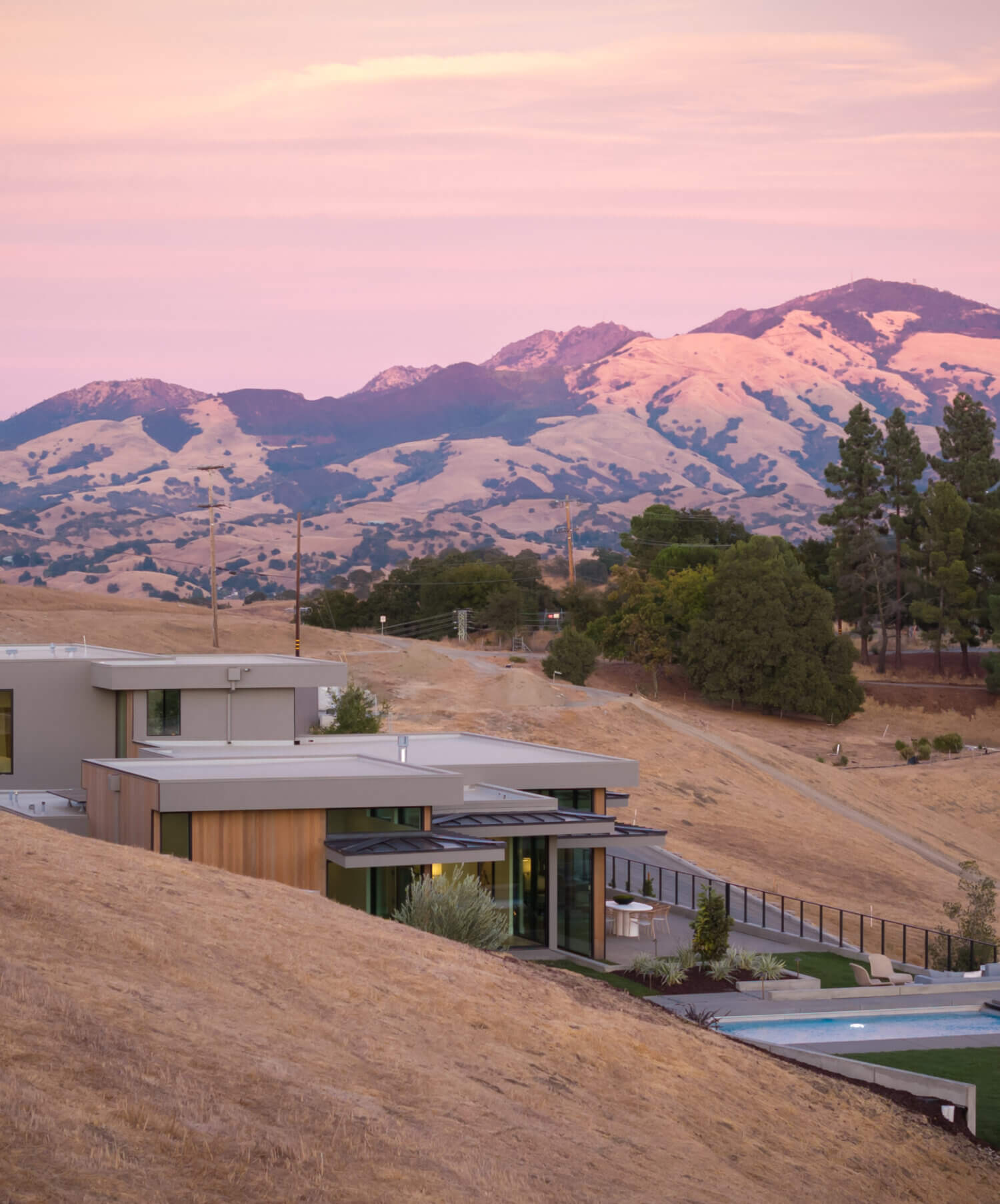
Alongside Diamond’s core brand, we also develop the branding for their multifamily projects, each shaped around its own location, audience and market positioning. Each luxury residence identity is designed to capture a distinct personality and sense of place while remaining connected to Diamond’s overarching principles of craftsmanship, quality and longevity.
Through bespoke naming, typography, colour palettes, visual storytelling and web design, each project is given the flexibility to stand confidently on its own while forming a part of the wider Diamond ecosystem.